Visualizing The Privacy Policy of Pinterest.com
Aman Singh
My research focused on exploring ways in which designers can facilitate agency and ethical understanding in social media users. This study began with the investigation of how consent forms for online platforms are designed, the rules that govern them, and the amount of user information collected through these forms.
In order to understand how user behavior can be modified using data, it was important to give them a way to engage with complex data. After conducting various experiments in data visualization using simple and complex data, I wanted to explore if visualizing an entire consent form or a privacy policy statement from an online platform, would lead to engagement from users?
This design experiment is based on the paper Visualizing Text Based Data: Identifying the potential of visual knowledge production through design practice, by Dr Jacqueline Kasunic & Dr Kate Sweetapple.
‘As increase in the availability of digitized data coupled with the development of digital tools has enabled humanities scholar to visualize data in ways that were previously difficult. While digitization has led to an increase in the use of methods that chart, graph and map text-based data, opportunities for visual methods are non-aggregative remain underdeveloped’ (Kasunic & Sweetapple, 2015).
In their text the authors discuss through a series of visual experiments, how the production of knowledge is enacted textually, within the written language and graphically with the visual arrangement of text.
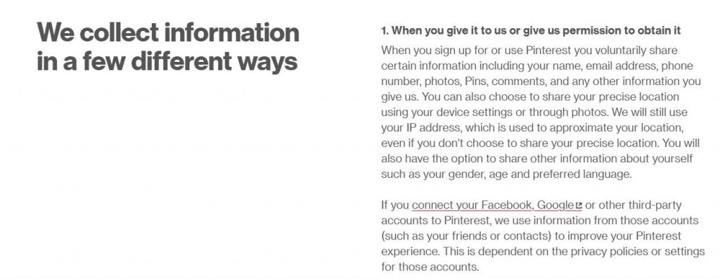
For this particular action, I made an attempt to break apart the entire Privacy Policy document of Pinterest.com as available on the internet. The document is 17 pages long with 4395 words just on the first page (without going into other pages from the links).
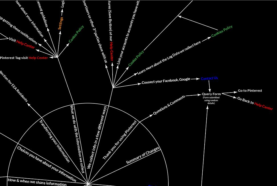
To break it apart I started with the first 14 sections of a circle (which are the different section headings throughout the document). Since the document was massive, I decided to map out just the links on the document and track where each link took me, hoping to discover if these forms have information on how they use “user data”.


After going through a few links I began to realize that each link was referring back to the same part of the document called the Help Center. The interesting outcome of this design experiment was that almost all internal links on the document led to Pinterest’s Help Center and links to it appeared 16 times on the visualization, while other links like Contact Us, Settings, Cookie Policy and Privacy Policy appeared 14, 12, 4 and 2 times respectively.
The Help Center turned out to be this final page with a little “Contact Us” button at the end, which ultimately led me to sign-in to my account and complete a complaint form.

After mapping out each and every link of the Privacy Policy, I realized that this is a self referencing document which might not be the best way to get answers regarding Privacy, User Data and how it is being used by Pinterest.

But since this was just my first attempt ever to map out a consent form I tried to do the same experiment with the Privacy Policy of WhatsApp. Not expecting a different result there either, I concluded that WhatsApp was doing the same thing. Just like Pinterest, the Privacy Policy of WhatsApp also leads the user finally to their Help Center, which is categorized into sections like General, Android, iPhone and many more.

Finally, after attempting to visualize the Privacy Policy statements of Pinterest and WhatsApp I was able to conclude that all these documents are self referencing and breaking them apart will not the best way to provide users agency to understand their data and how it is used by these platforms.
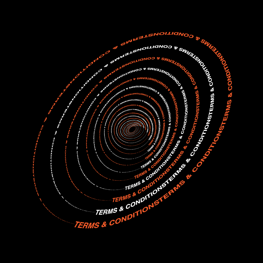
Below is a visualization of my understanding of these consent forms.

Privacy Policies are self referencing documents that keeps taking the users back to same part in the document.


