Dialogue With The East
Xi Qiu
See it On Campus: Level 2
Visitor Info
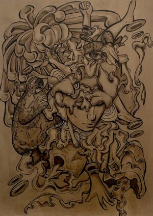
“A visual exploration of Dim Sum culture that bridges cultural conversations, memories, emotions and more. Every food comes from the heart. It celebrates a source of deep connection, and together, immersing into the realm of oriental contemporary aesthetics.“

Dialogue With The East
My thesis looks into the intertwined relationship between Canton food & tea, cultural stories, human interactions & emotions, and how visual communication could influence the ways in which we dine and interact. The project will be divided specifically into the history of Dim sum’s culture in Vancouver mainland and ways of finding new dining experiences/aesthetics into public spaces. In short, I seek to probe the ways of refurbishing visual identity and to know the implications of art+design in public spaces.
My thesis is preliminary branding for a Dim Sum restaurant, “Soo” Through my lens and perceptions, I am interested in exploring the visual language and diving into oriental aesthetics to introduce Dim sum. On the other hand, working multilingually is necessary for understanding socio-cultural contexts and appropriately visually communicating them. Most importantly, it is a great opportunity to spark cultural conversations while eliciting an emotional appeal and meaningful presence with my audiences.
Overview
Have you ever wondered what else to have as breakfast apart from cereal or pancakes? Dim Sum, also known as Cantonese teahouses or Yum Cha, is a beautiful tradition in the Southern areas of China, in Guangdong and Guangxi (including Hong Kong). When transliterated from Chinese, it means “a little piece of heart.” This tradition has almost become an integral part of Cantonese everyday life. Many locals believe that this morning tea ceremony is to meditate and relax before the bustle of the day begins. It is the best place for chatting and fostering stronger kinship with people through food.


From the graph listed above, it can be seen that Calligraphic script is the most prominent use of characters for restaurant names, accompanied by the most used Old style and traditional serif typefaces for the English system.
Colours were also documented. It is evident that gold, Crayola yellow and true red were the most popular colours. With all this coming together, it is noted how simple signs can Influence the viewer’s understanding of perception and memory preservation. The voices of typeface should also help with the meaning of words itself to be effective.

Visual Development


Final Highlights


Gallery